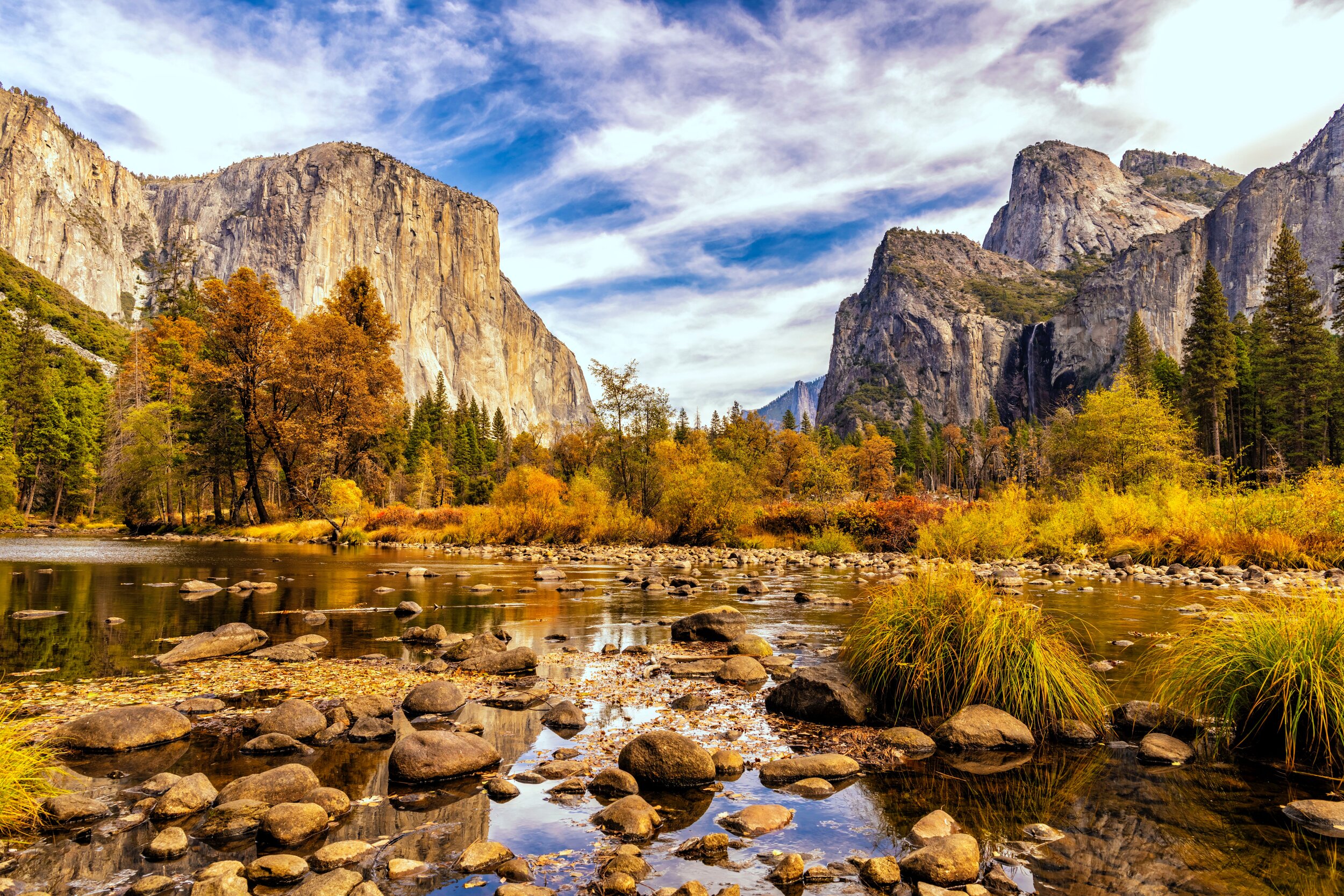
Yosemite.org Website
YOSEMITE
EXPLORE AND CONSERVE THE PARK YOU LOVE
Role: Web Project Management Consultant
Technologies: WordPress
Tools: InVision, HotJar, Google Docs
About Yosemite Conservancy Website
Yosemite Conservancy has been preserving and enhancing the Yosemite National Park for over 95 years in partnership with the National Park Service. They have raised more than $125M to fund work that covers a variety of topics, from trail repairs to wildlife management. The non-profit helps visitors connect with Yosemite through adventures, volunteering and the arts, and funds grants for high-priority projects, including restoration, educational programs and research.
Defining the Problem
The Conservancy had a 10+ year old website that made it difficult to find information, was not user-friendly, and was out-dated. They needed a new website that consolidated their 1,400 pages into something that was clean, simple, and easy to use that portrayed their impact and their mission. The audience is also around 70 years old, so the site needed to be designed with that audience in mind.
The Process
Our core team was comprised of a Chief Strategy Office, Chief Executive Officer, Behavioral Scientist, Director of Marketing, Marketing Manager, Designer, and Lead Technologist. I also worked with the Programs, Development, and Executive Team for input throughout the process.
The process included:
Discovery Phase - data/requirements gathering, user interviews, Google Analytics and HotJar heat maps analysis
Agency Interviews - interviewed 25 agencies to find the best fit for the project
Request for Proposal - wrote the request for proposal with all project requirements
RFP Review - created RFP scoring matrix to select top agency
Persona Development - worked with the selected agency to define the user personas
UX Design - designers created 3 rounds of wireframes that outlined all the core functionalities and modules needed for the site
UI Design - the visual designer brought the wireframes to life with images and color that fit within Yosemite Conservancy’s brand guidelines
Development - the front-end and back-end team worked together to build out the functionality
Launch and Testing - we went through several quality assurance tests before and post-launch
The Result
The site launched with great user enthusiasm and feedback. It now has a beautiful, clean, and easy to use navigation and interface. When a user comes to the site it is immediately apparent who the Conservancy is and the impact they have on the park.

